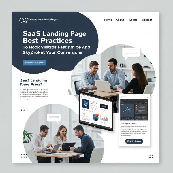
SaaS Landing Page Best Practices That Actually Get People to Say “YES!”
Alright, real talk for a sec: crafting a SaaS landing page that stops people mid-scroll isn’t exactly a walk in the park.
Your visitors barely know you — and let’s be honest, skepticism runs sky-high. You’ve got precious seconds to make a solid first impression. Done right, your landing page isn’t just a page — it’s your best salesperson, working 24/7. So, how do you make it killer? Let’s dive into the SaaS landing page best practices that’ll crank your conversions up.
Why Your SaaS Landing Page Must Impress *Fast*
Unlike selling a cute tee or gadget, SaaS is intangible. Folks can’t physically “size it up” — they have to take your word. That’s where your landing page steps in: it must earn trust, build curiosity, and invite action — all in one sleek package.
“In marketing, clarity wins every time.” — Donald Miller
SaaS Landing Page Best Practices That Actually Work
Nail the Headline or Kiss Conversions Goodbye 🎯
- Clarity > Cleverness. Make them understand immediately.
- Focus on the outcome, ditch confusing jargon.
Example: Instead of “Optimize Your Business Process,” say 👉 “Slash Hours Off Your Workflow — Without Breaking a Sweat.” Immediate impact, right?
Keep the Hero Section Simple and Selling 👀
People don’t want your whole brand story upfront. Lock in these three essentials:
- What your tool does
- Why people should care
- What action they should take next
Add a value-packed headline, a lite-trusting subheader, a clean graphic, and ONE crystal-clear CTA — no distractions.
Focus on Benefits, Not Just Fancy Features 🛠️ ➡️ 🎯
Features tell; benefits sell. Translate your tech specs into real-life wins for the user. Ask yourself: “Why would someone who doesn’t know us even care?” Then answer it on the page.
Use Social Proof that Feels Human 🏆
- Real customer testimonials (skip cheesy stock photos)
- Recognizable logos showing who trusts you
- Honest numbers (“10,000+ teams rely on us!”)
Micro-testimonials and user screenshots often double conversions — true story!
Craft CTAs That Practically Beg to Be Clicked 🎯
- Use bold, high-contrast buttons
- Say action-driven things like “Get Started Free”
- Place CTAs generously — top, middle, and bottom
Don’t make visitors search like detectives to take action. Make it obvious, and make it easy.
Show Off with Videos or Interactive Demos 📽️
People trust what they see:
- Keep videos under 2 minutes
- Show AHA moments, not technical setups
- Embed click-through interactive demos when possible (bounce rate magic!)
Speed Matters: Fast > Fancy ⚡
Page load time is non-negotiable:
- Under 3 seconds = the sweet spot
- Mobile experience should be silky smooth
- Optimize all images and scripts (yes, even that massive GIF you love)
Slow = no trust + bad Google rankings. Keep it speedy!
Quick SaaS Landing Page Checklist 📝
- Irresistible value proposition
- Headline that slaps (in a good way)
- Laser-focused hero section
- Authentic social proof
- Bright, action-packed CTAs
- Demo or video “aha” moments
- Lightning-fast performance across devices
Hit 85% of this list, and you’re already outperforming most SaaS pages out there. Seriously.
Common FAQs About SaaS Landing Pages
Q: How many CTAs are too many?
A: If visitors feel overwhelmed, you’ve gone too far. Stick to one at the top, one mid-scroll, and one at the bottom.
Q: Should I offer a Free Trial?
A: Depends! If your SaaS is quick to grasp, yes. If it’s complex, better to invite them to book a demo.
Q: Should my landing page be short or long?
A: It’s not about length — it’s about clarity. Start short, expand based on user curiosity with collapsible details.
Final Takeaway: Human First, Tech Second
Your SaaS landing page is your one shot at making strangers believe in you. Talk like a human. Show benefits. Make the next move ridiculously easy. Polish it until users can’t help but say, “Heck yes, where do I sign up?”
And if you need an extra set of eyes to fine-tune your page? Grab that coffee — I’m just a click away. ☕🚀

